
Our professional podcasting platform hosts millions of podcasts, and a great amount of them are added every day. Helping all these content creators to grow and monetize their podcasts has been a top priority for us since day one. And, in order to do so, we need not only to provide the best possible podcasting tools and services, we also need to monitor the shows and remove those users that try to use our platform in ways that violate our terms of use.
A typical case of such a behavior is copyright infringement. That is, for instance, when a user uploads copyrighted content (without the consent of the copyright holder) and then tries to distribute and monetize such content.
Fortunately, we have several ways to fight against fraudsters on our platform. Some of these ways rely on Artificial Intelligence algorithms that have been trained to detect illegal behaviors.
We also have in place several heuristic rules that are able to identify suspicious activities. Most of the time, the algorithms are able to decide whether a user is trying to misuse our platform or not. But, in other border-line situations, we need to conduct a case-by-case manual investigation before reaching the final decision.
For that, and since we humans are very good at processing visual information, we have decided to create a Unified Fraudster Detection dashboard using AWS QuickSight.
This dashboard is used on a daily basis to highlight and prioritize information that help us investigate and make a final decision about possible fraudsters.
What is QuickSight?
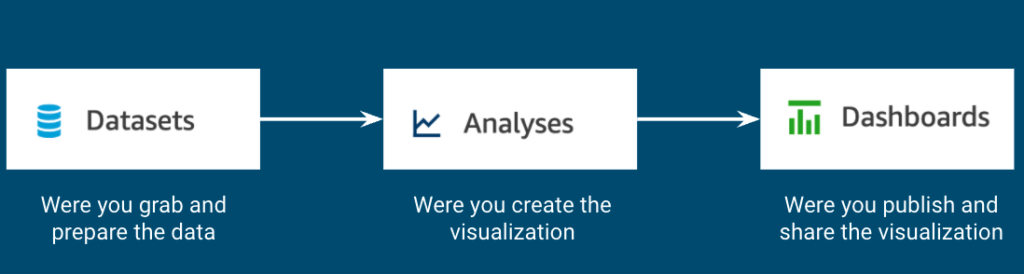
QuickSight is an AWS tool designed to create interactive dashboards. The usual way to create a new dashboard is to start by creating a new Dataset (where you grab and prepare your data). Next, you create an Analysis (where you design the future dashboard). And finally, you share the final version of the analysis as an interactive read-only Dashboard.
When creating a new dataset, QuickSight will allow you to import data from several data sources like CSV files, S3, Athena, MySQL, etc…
After importing all your data sources into the new dataset, you can click on the “Publish & visualize” button that will allow you to start building your visualization.
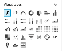
The first step for creating a visualization is to choose the type of visual you want to depict. QuickSight offers many chart options like, bars, gauges, pies, donuts, lines and area lines. It also offers more sophisticated plots like heat maps, histograms, box plots, scatter plots, funnels, maps, sankey diagrams, etc… (see all the offered visual types here).
After selecting the Visual type, you will be able to drag and drop all the relevant values to flesh out the visualization with data from your dataset.
For instance, if you decide to create a Bar chart, you will need to define what fields from your dataset will correspond to the X axis and to the Bar values. Optionally, you could also decide if you want to add a Group/Color field.
Finally, you can customize the displayed information like chart and axis titles, choose the right format for the data values, etc.
Joining forces
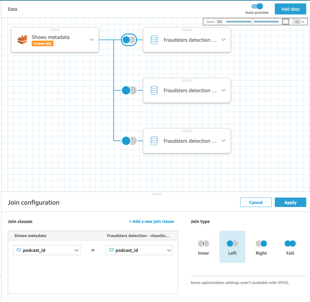
One very powerful feature of QuickSight is the fact that you can join several data sources into a single dataset. This new dataset will allow you to create visualizations that show information from several sources at the same time.
This strategy is the one we have followed in order to create our Unified Fraudster Detection dashboard. In our case, we have joined several data sources that are able to raise an alert when they notice a specific suspicious behavioral aspect of podcast listeners or of podcast authors. This join process can be easily done by using the GUI provided by QuickSight.
Another very useful feature of QuickSight is the possibility to create “calculated fields”. This gives you the option to create new data columns by applying operators and functions to your original data.
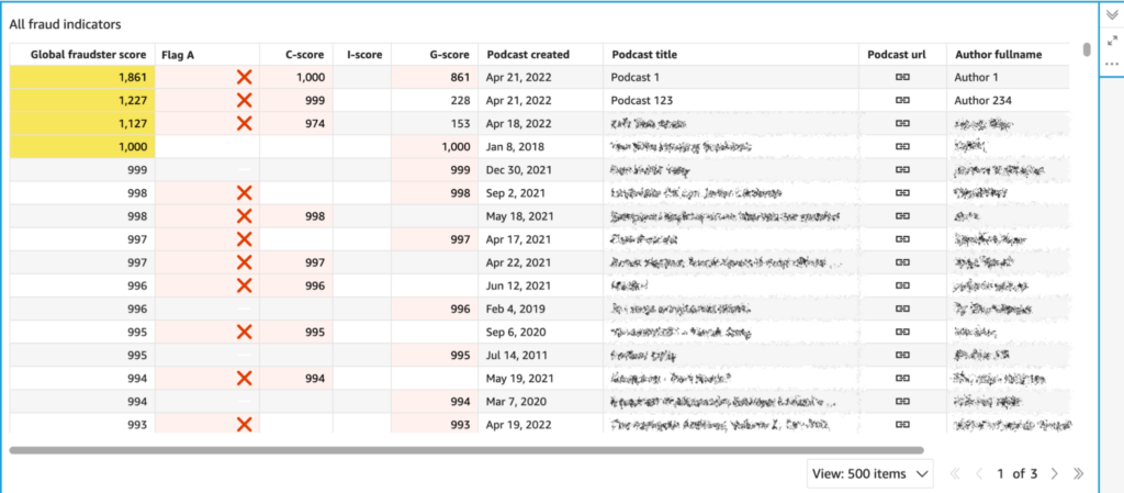
In our case, after joining all the fraudster-related sources, we have created a new calculated field that produces “Global fraudster score” after adding up weighted values from the individual sources.
In the Analysis step, we have created a table view that shows an ordered list of all possible fraudsters as identified by the Global fraudster score. Podcasts that exceed a specific Global fraudster threshold are also highlighted in the visualization. The table also shows information about podcasts being present on some specific distribution platforms and quick links to internal inspection tools that we use to manage content in our platform.
Some caveats
Even though QuickSight has powerful features, it also has some issues that you need to be aware of:
- Sharing Datasets: A common source of frustration is the sub-optimal way Datasets are shared. When you share a Dataset, the UI allows you to select what users you want your Dataset to be shared with. However that is not enough for the selected recipients to be able to work with your data. In addition, you need to share the underlying Data Sources with them too. And that is a pain. In order to do so, you need to click the button for creation of a new Dataset. That opens a screen where you can see existing Data Sources and there you need to select the underlying Dataset, open its details and only there you can share the Dataset with intended recipients.
- Impossibility to display all desired data: When you have more than a few rows and columns, QuickSight does not display them all. Instead, it decides to display just X top or bottom of them. It tells you how many they are in the chart’s description but it just doesn’t display all that you need. And there is no way to know beforehand how many of them it will pick.
- Impossibility to fully customize visuals: Even though there are many options of how you can customize your visuals, some are surprisingly missing. For example it’s impossible to specify that the scale of a heat map displaying percentage data should go from 0% to 100%. Instead QuickSight decides that the maximal value is the one present in displayed data. Which renders this type of visualization useless in some cases.
Conclusions
The Unified Fraudster Detection dashboard has proved to be an excellent tool to fight against fraudsters and spammers. We inspect this dashboard on a daily basis and we keep adding new fraudsters indicators every time we detect new suspicious patterns.
A very useful “side-effect” of this manual flagging process is that, in the long run, it provides a valuable dataset to refine the training of supervised machine learning algorithms.